REVIEW: William Steiger in the Chicago-SunTimes
June 29, 2007 - Margaret Hawkins
Selective viewing is essential to sanity. The human brain can only process so much information at once, and those whose brains don't shuffle, edit and erase most of what they see and hear go mad. Order makes understanding possible.
On the opposite end of this spectrum of perception is painter William Steiger, the owner of an orderly eye if ever there were one, who selects only the most pleasing and succinct details from a tacky and complicated American landscape and paints those in flat color and high relief against otherwise blazingly blank backgrounds of whiteness. Or at least these details are pleasing to his own quirky eye. Others might find them mundane.
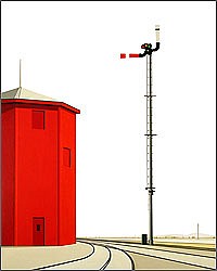
The bits of the world Steiger focuses on with his laser-like attention are the man-made parts notable for their simple and elegant design, those architectural and mechanical pieces of our world that are not only functional and beautiful but also a little nostalgic.
Cable cars hang in mid-air, held up by the thinnest of wires. Water towers -- those lighthouses of the prairies, skyscrapers of the great plains -- stand stark against blank white skies. Roller coasters, Ferris wheels, railroad bridges, tunnels: These are Steiger's humble icons of perfection. A train caboose is reduced to an abstract pile-up of geometric shapes in red, black and gray. The apparently sun-bleached walls of a grain elevator disappear in the whiteness of the background. The best of these are the least cute and commonly iconic, the water towers and the grain elevators, subjects with the least intrinsic interest that are most easily dissolvable into abstraction.
The effect of this minimalizing technique is almost musical, the isolated objects look the way a few notes sound when they are surrounded by silence. The white acts as a pause that allows us to "hear" the thing because Steiger has eliminated so much environmental detail. Fashioned with the same attention to precision that designers
gave to the machines and buildings that inspired Steiger in the first place, each painting is a perfect invention.
Together, the body of work seems like an homage to the mathematics of engineering, with each object illuminated by a cleansing, almost blinding light and without a trace of human presence or sentiment.
Steiger's work approaches abstraction in places and there is a sense here that if a few more edges were removed, the literal meanings of these paintings would dissolve into planes of flat color. It is Steiger's particular genius, though, that they don't have to lose their literalness to keep our attention. Instead, they remain poised on the edge of obviousness, teasing us with what else they might mean. They almost seem to deconstruct themselves. As we look, they disappear; we see less and less solid form and more and more light.
The paintings also recall Pop art, though weirdly. Instead of Warhol's kitschy soup cans, we get cute outmoded vehicles, including a dirigible. And like Warhol's paintings, Steiger's appear to be inspired by photographs of things rather than the things themselves, a technique that allows the artist to treat his subjects as icons rather than as real places.
Unlike Warhol, Steiger honors the engineer, not just the ad man. He's a little like the proverbial watchmaker. He has set the ideas in his paintings in motion and then he steps back to admire his craft and to watch them work. Refreshingly, there is no sense of heated artistic ego or creative chaos here. Just the opposite -- Steiger makes paintings that instill a cool sense of order.
BY MARGARET HAWKINS
Download Article (PDF)Back to News