ESSAY: John Adelman Catalogue
February 15, 2013 - Jonathan A. Molina Garcia
For most of his career, John Adelman has explored the material qualities of ink on paper, creating works of art that take on an incredible physical and visceral presence after successive layers of ink have been industriously applied. His compositions are strictly defined by a series of rules that the artist sets for himself. As others have noted, they follow – if a little peripherally - in the footsteps of minimalist and conceptual rule-based art that saw the likes of Sol LeWitt or Josef Albers, and a post-structural interest in art as text, rife with connotative value.[1] Execution here for Adelman is far more important than it ever was or could have been for LeWitt, who saw it as a “perfunctory affair.”[2] Rules exist for Adelman, but they would be almost impossible to repeat without some background in graphology or a predisposition to reproducing another’s handwriting.
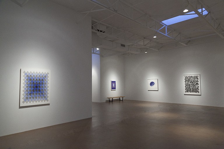
One of Adelman’s ongoing interests is tracing nails and other detritus that have been collected and then dropped unto his working surface. The exact number of traced items – some of which have gone into the hundreds of thousands – are preserved in the titles.[3] In 35,135 (2013), for example, if one had the sanity to count, a cosmic bubble visualizes the density of its over thirty thousand tiny inhabitants.
We might say language is his other great affinity, and it finds him reproducing words and definitions straight out of a dictionary – his primary source material of late. Like previous works, titles reveal hidden structures. In this case, new pieces are named after the last word of the preceding piece. His obsession with language, and ostensibly dismantling its linguistic structure, could be compared to the work of Mira Schendel, one of Brazil’s most prolific artists. Her drawings from the series Objetos gráficos (Graphic objects) of the late 60s and early 70s have a kinship with Adelman’s restlessness, and similarly use words as a visual object, studiously addressing signs and symbols as a material. His words, however, are far more likely to be comforted by the barriers of geometry. Due to the rules he applies to each work, the words are arranged into shapes of circles, rhombuses, or other simple forms, and are often stacked neatly into grids (Fluid [2013], Exchange [2012]). In Fluid, for example, the diamond grid is filled “by using the start word’s first letter numerical counterpart to determine how many quarter sections to move (horizontally). The quarters were filled until every one was filled at least once.”[4]
Other times, when these grids or organization methods are less obvious, in pieces that seemingly hark back to the sublime tendencies of color field paintings, they obliterate the entire canvas and create majestic seas of blues and purples. Commatism (2010) and Encapsule (2007) are examples of this latter method, in which words leave no room for the original white of the paper to emerge, and depending on how light reflects it, create an almost optical effect of subtle, watery blues that one might liken to a lenticular print. In yet another throwback to postwar American painting, they also take on certain properties of dyes or soak stain techniques for which some of Morris Louis’ more de-saturated stains are a fair comparison. Similar use of color can be seen on Adelman’s non-language works, like in 6796 (2008) and 51,986 (2011-2013), where the traced, fallen nails punctuate a surface that is a nebulous and aqueous field of blues.
While Schendel’s use of language was approached from that of a philosopher and poet (she would continue keeping an active presence in both disciplines until her death), Adelman’s approach is perhaps more primal, almost nostalgic.[5] One imagines the artist as a schoolboy writing words and writing definitions as part of a teacher’s punitive reprimand. Indeed, his most favored material, the ink pen, speaks of utilitarian, economical use in the classroom, with the perennial yellow no. 2 pencil perhaps lying just off to the side. The classroom analogy is also particularly striking in works like Dictionary II (2004) which begin to resemble dusty chalkboards, or in Carry (2010), where the blue-black scheme is inversed and the white text appears chalk-like.
Without an authority figure, however, we are only left with the artist, lashing himself with words and eccentricities that add up to a list of non sequiturs. For Gadrooning (2007-2008), he writes, “the surface is filled with a series of text-filled circles. Each diameter size of the circle, as well as the number of circles per grid-square was determined by the numerical sequence of the word fill.”[6] But why must it determine diameter and not radius? Or circumference? And why should “fill” be the operative word that guides the work’s construction? Left without an answer, his rules, we might say, reveal the very arbitrary nature of our own words, and the seemingly haphazard rules that govern how we communicate and codify such communication in written form; moreover, how the individual gestures of writing and penmanship, with its plenitude of quirks, can disrupt how meaning is received. To quote Barthes, “Writing in short is nothing more than a kind of fissure. It is a question of dividing, of plowing, of discontinuing a flat element, sheet skin, clay tablet, wall…. The hand, the eye, guide the writing, not the reason of language.”[7] In the end, what Adelman calls “rules”, we might call certain disruptions for the purpose of restructuring, and what he calls “words”, we might call something else entirely; a sublime kind of fissure that deliberately eludes legibility in favor of a more visual, sensory, and scopophilic syntax.
[1]“Logical Conclusions: Drawings (2005-2012)” Diane Rosenstein Fine Art and Todd Camplin, “John Adelman – Trace Evidence,” Modern Dallas (July 2011)
[2] Sol LeWitt, “Paragraphs on Conceptual Art,” Artforum 5.10 (1967), 12.
[3] Marc Brubaker, “100 Creatives: John Adelman,” Houston Press 12 July 2011 http://blogs.houstonpress.com/artattack/2011/07/100_creatives_john_adelman.php
[4] From John Adelman’s list of rules for the present exhibition.
[5] Luis Pérez-Oramas. León Ferrari and Mira Schendel: Tangled Alphabets, exhibition catalog (New York: Museum of Modern Art, 2009): 14 and Laura Cumming, “Mira Schendel – Review,” The Observer, The Guardian, 28 September 2013. Web.
[6] John Adelman
[7] Roland Barthes, “Variations sur l'écriture,” in Oeuvres Complètes: Tome IV: 1972-1976, ed. by Eric Marty, new ed. (Paris: Seuil, 2002), 289-90.
Back to News